
GREETINGS
FROM BOONE
Adobe Illustrator, InDesign & Procreate
“Greetings from Boone: A Postcard Project” is an illustrated postcard series that celebrates the charm and character of Boone, North Carolina. Each postcard highlights a distinct local spot, chosen to reflect the town’s diverse and vibrant community. Designed to both inform and invite exploration, the project encourages locals and visitors alike to slow down, step outside, and engage more deeply with their surroundings. Beyond documenting place, the postcards promote mental well-being by fostering mindful interaction with nature, a sense of discovery, and appreciation for the small, meaningful moments that make Boone feel like home.
"Postcards from places worth noticing."
Front of Postcard Example:
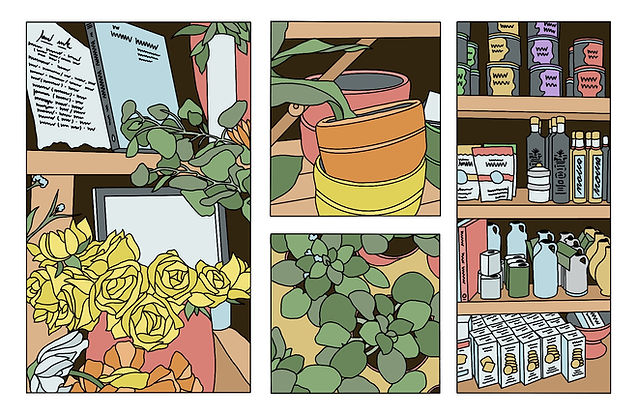
Each postcard was hand-drawn digitally in Procreate, with illustrations arranged in a four-square layout. The quadrant arrangement varies on each card, letting them stand alone while connecting visually. Placed together, the postcards form a larger collage.
Back of Postcard Example:

The back of each postcard is mail-ready, with space for an address and stamp, the place’s name and a brief description, and a QR code linking to their website. This design ensures each card is both informative and easy to share.
This carousel presents the full postcard series as a continuous visual sequence. Shifting compositions and varied moments invite viewers to explore each card individually while noticing how they relate to one another. Together, the set reads as a rhythmic progression rather than a single, isolated design.
"Slowing down, one card at a time."


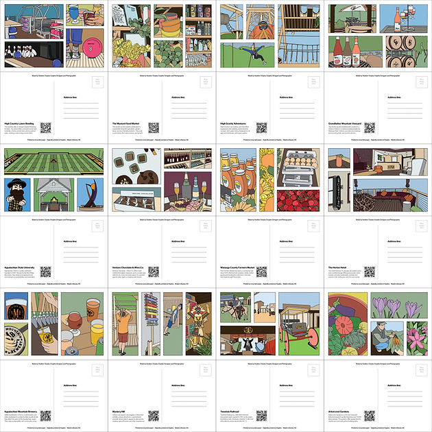
Postcard Collection Overview:

Postcard Design Details:

This image shows the complete set of twelve postcards presented together as a unified collection. While each postcard highlights a different location, similar color palettes and visual tones are used throughout to create cohesion across the series. When viewed together, the shared color schemes help the individual designs feel connected, reinforcing the project as a single, larger visual system.
Locations Featured On Postcards Below:
-
High Country Lanes
-
The Mustard Seed Market
-
High Gravity Adventure
-
Grandfather Vineyard
-
Appalachian State University
-
Venture Chocolate and Wine
-
Watauga Farmers Market
-
The Horton Hotel
-
Appalachian Mountain Brewery
-
Mystery Hill
-
Tweetsie Railroad
-
Arborcrest Gardens
Click the image on the right to view full size!
Postcard Back Variation 1:

This image captures the first draft of the postcard back, exploring initial typography, spacing, and wording choices. Handwritten annotations mark early ideas and considerations for improving readability, balance, and overall clarity.
Postcard Back Variation 2:

This image documents a second draft of the postcard back, refining layout decisions around spacing, hierarchy, and functional elements such as address lines and QR code placement. Handwritten annotations highlight ongoing usability considerations.
Postcard Layout Concepts:

Possible Locations List:
